Last week there was a discussion on X (former Twitter) about the usage of the NumberBox in WinUI apps. Should it accept letter inputs or not. The 'conlusion' was that it should because you can enter formulas. But there are also a few developers which don't like this. So I took up the challenge to find a solution for this problem. My first guess was that I should create an AttachedProperty or Behavior for this. I was wrong. AttachedProperties can't be used for this. You can't use them for handing events on controls. Behaviors can but they require you to add an extra NuGet package to the project. Something you might not want. So I decided to use compiled binding (x:Bind) to events, also known as Event Binding.
You can customize the appearance of your apps in many ways by using the XAML framework like WPF, UWP, WinUI and MAUI. Styles let you set control properties and reuse those settings for a consistent appearance across multiple controls. Styling is to XAML what CSS is to HTML. Using styles, you can group a set of properties and assign them to specific controls or all controls of a specific type, and just like in CSS, a style can inherit (BasedOn) from another style.
Starting with WinUI 2.6 there are new styles for most of the controls. It is encourage you to use the new styles, as they better match the design direction of Windows. You can read more about styling.
Many years ago Scott Hanselman wrote the famous Scott Hanselman Ultimate Tools List post. In 2019 I wrote my own list, now it is time for an update because there are new tools I use. I'm a Windows App developer more than a Web developer so I use different tools. I write mainly XAML (UWP, WPF, WinUI and UnoPlatform) apps and only occasionally an ASP.NET MVC, WebAPI or Blazor WASM projects. My code is written in C#. I create them because it is fun to do and it helps me to train my own skills. I use this experience for my trainings (C#, XAML, ASP.NET and SQL). I write my own training material so I need the experience. I have developed about 50 Windows (and Windows Phone) apps, some are very popular. The apps have more than 5 million downloads and daily thousands of players. Most of my apps are free but there are Ads in it to generate some revenue.
Accelerator keys (or keyboard accelerators) are keyboard shortcuts that improve the usability and accessibility of your Windows applications by providing an intuitive way for users to invoke common actions or commands without navigating the app UI. You can add them to a Button using the KeyboardAccelerators property. See the example below.
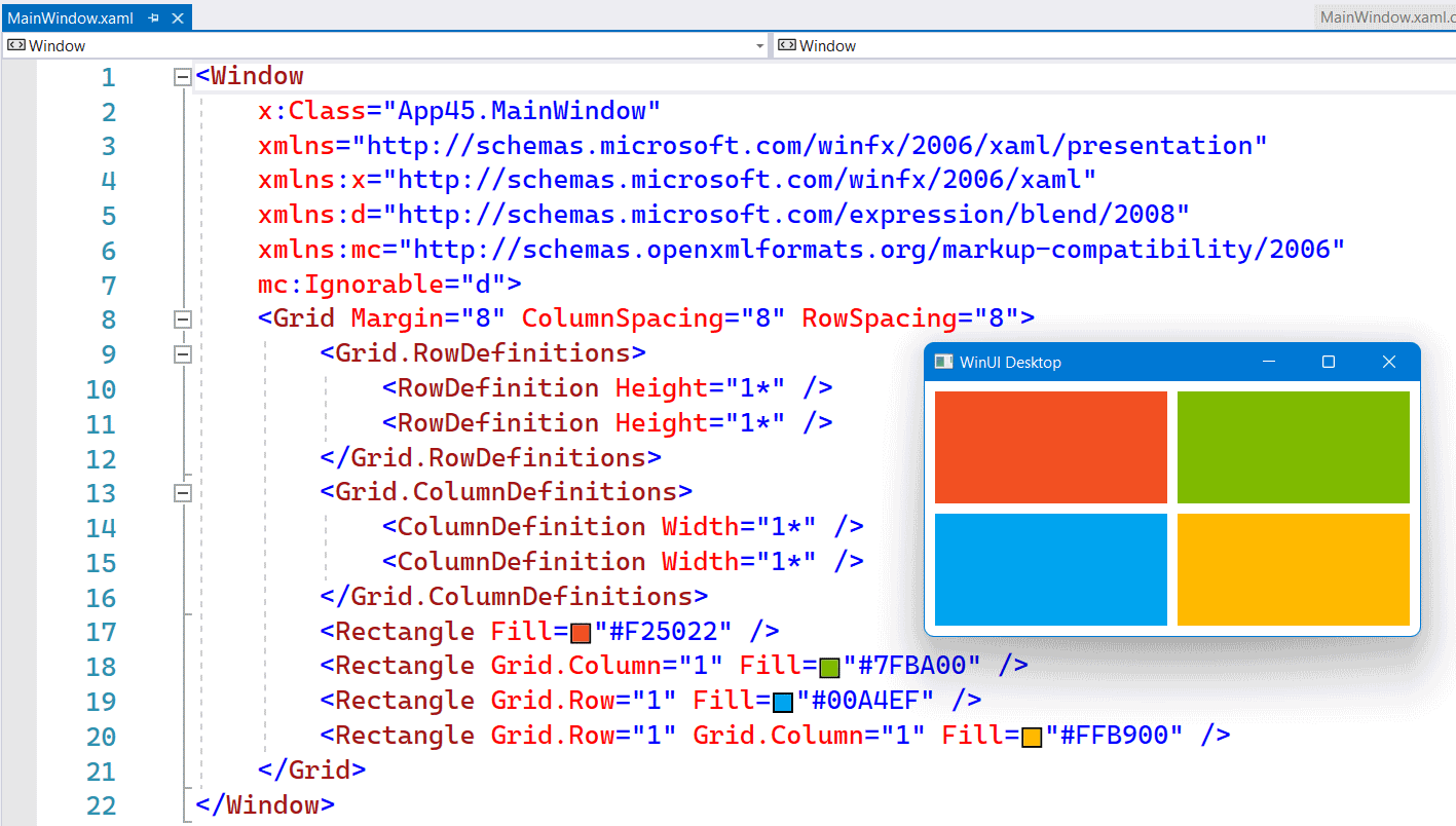
In the XAML of WinUI3 apps you can use the inline syntax for creating Rows and Columns inside a Grid. This is a feature which Avalonia had for a long time. It is more compact and works fine as long as you don't need a Max or Min Width/Height.
The following screenshot shows you a Grid with 2 Rows and Columns. Both in equal size. Using 4 Rectangle elements I created the Microsoft logo inside this Grid.
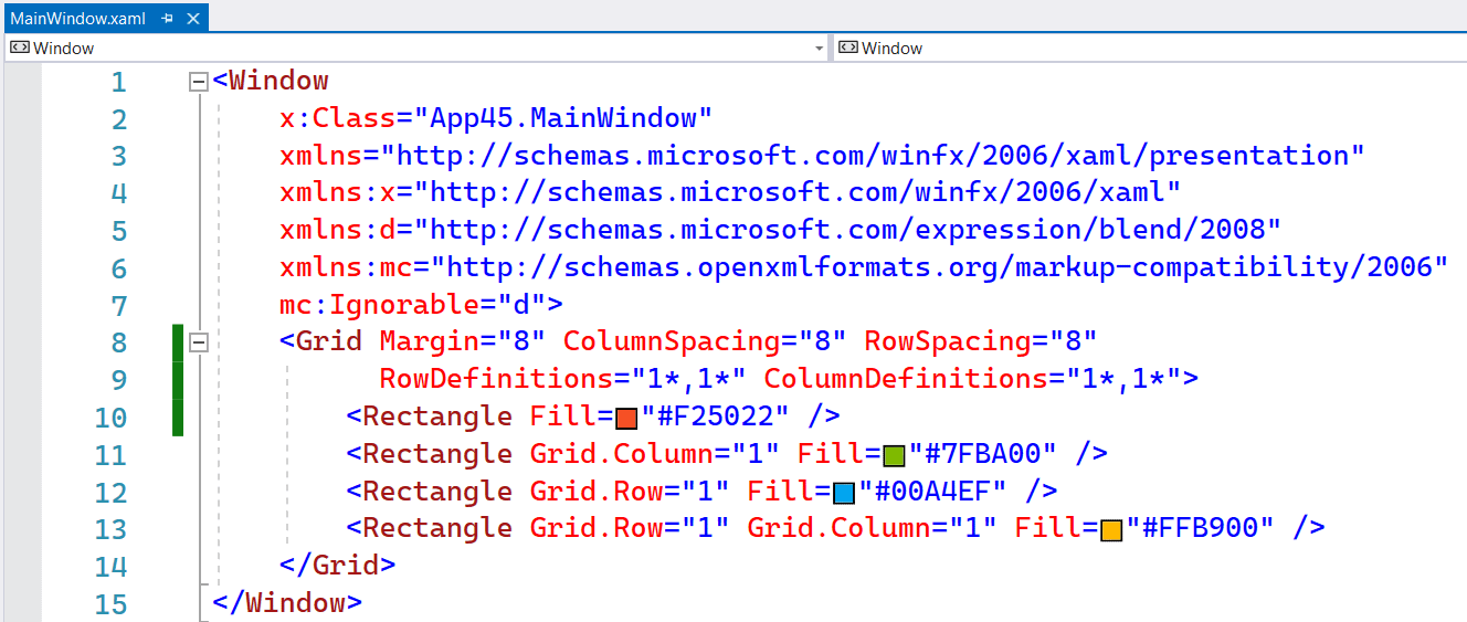
The following screenshot shows you the same Grid but now with inline RowDefinitions and ColumnDefinitions. It saves you a few lines of XAML.
You can customize the appearance of your apps in many ways by using the XAML framework. Styles let you set control properties and reuse those settings for a consistent appearance across multiple controls.
With Lightweight styling you override the system brushes, and the color override will affect all controls that reference that brush. Although this is called styling you are not defining a style. You just create a ResourceDictionary with a ThemeDictionary in which you override the system brushes.
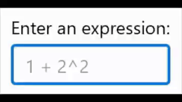
If you write business apps, there are a lot of controls for data input: TextBox, CheckBox, ComboBox, DatePicker, ToggleSwitch, TimePicker, RadioButton, Slider, etc. I always wondered why there was no NumberBox. Numeric input is very common so it needs its own control for it. Luckily there is the Windows UI Library (WinUI), an open source project from Microsoft. I proposed the NumberBox last year and the team did a great job implementing it. It is released in version 2.3 and most of the issues are now solved. Time for a blog post showing of its features.
This animated GIF demonstrates a few of the features like AcceptsExpression, PlaceholderText, SpinButtons and NumberFormatter. I 'stole' it from this tweet.
Many years ago Scott Hanselman wrote the famous Scott Hanselman Ultimate Tools List post. Now it is time to write my own list because there are new tools. I'm an App developer more than a Web developer so I use different tools. I write mainly XAML (UWP and WPF) apps and only occasionally an ASP.NET website. My code is written in C#. I create them because it is fun to do and it helps me to train my own skills. I use this experience for my trainings (C#, XAML, ASP.NET and SQL). I write my own training material so I need the experience. I have about 40 Windows apps in the Store, some are very popular. The apps have almost 5 million downloads and daily thousands of players. Most of my apps are free but there are Ads in it to generate some revenue.
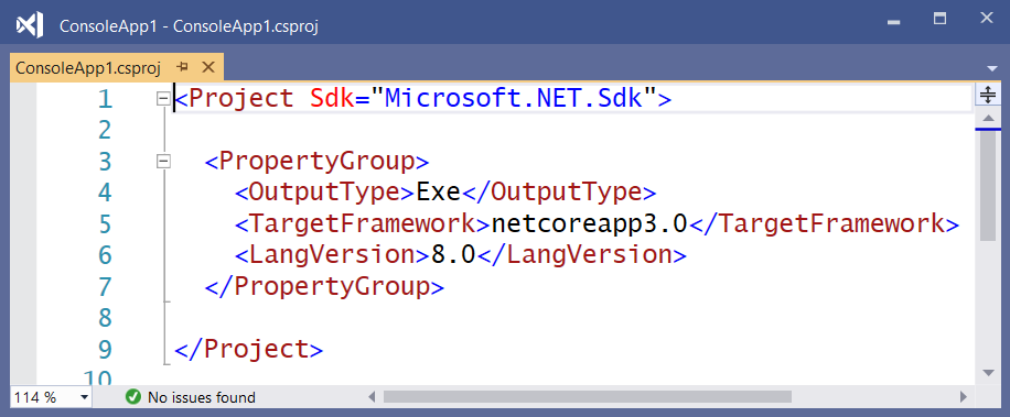
With Visual Studio 2019 Preview (currently version 16.2.0 Preview 3.0) you can use C# 8.0 in .NET Core 3.0 projects. You only have to set the Language version to C# 8.0 (beta) in the Advanced Build Settings. Make sure you do this for 'All configurations' and 'Any CPU', see screenshot below.
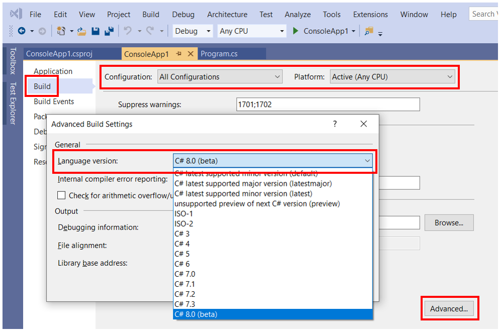
This setting will add a LangVersion property to your .csproj file (line 6).
The possibility to create your own Markup Extensions where added to UWP in the Windows Falls Creators Update SDK (16299, 1709). I only used it once. I created an OnDevice Markup Extensions which I added to the Windows Community Toolkit.
Last month Pedro Lamas wrote the blog post Making the case for XAML Markup Extensions. He demonstrates a FontIconExtension which he uses to shorten the XAML of an AppBarButton. I love his solution. His blog post inspired me to write some new Markup Extensions with the same goal, short XAML.