When you create a XAML application in Windows 8.1, you get a few built-in styles for TextBlock controls, such as: HeaderTextBlockStyle, TitleTextBlockStyle and SubtitleTextBlockStyle. Unfortunately there is no AccentButtonStyle. An AccentButton is a button with a special accent background color. I thought I’d try to create this Style. You can apply this Style to a Button. Optionally, you can set the Background property of the Button to a custom color.
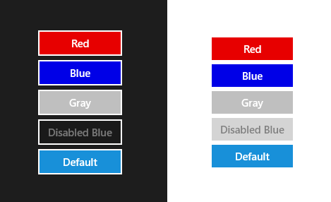
In the above example I have two StackPanels; the first with the RequestedTheme set to Dark, the second to Light. All Buttons in the StackPanel have the AccentButtonStyle. The bottom buttons have no Background property set. The 'Disabled' buttons have an IsEnabled property set to false.
<Page x:Class="AccentButtonDemo.MainPage"
      xmlns="http://schemas.microsoft.com/winfx/2006/xaml/presentation"
      xmlns:x="http://schemas.microsoft.com/winfx/2006/xaml"
      xmlns:d="http://schemas.microsoft.com/expression/blend/2008"
      xmlns:local="using:AccentButtonDemo"
      xmlns:mc="http://schemas.openxmlformats.org/markup-compatibility/2006"
      mc:Ignorable="d">

    <Grid Background="{ThemeResource ApplicationPageBackgroundThemeBrush}">
        <Grid.ColumnDefinitions>
            <ColumnDefinition Width="1*" />
            <ColumnDefinition Width="1*" />
        </Grid.ColumnDefinitions>
        <Grid Background="{ThemeResource ApplicationPageBackgroundThemeBrush}"
              RequestedTheme="Dark">
            <TextBlock Style="{StaticResource SubtitleTextBlockStyle}"
            <StackPanel HorizontalAlignment="Center"
                        VerticalAlignment="Center">
                <Button HorizontalAlignment="Stretch"
                        VerticalAlignment="Stretch"
                        Background="Red"
                        Content="Red"
                        Style="{StaticResource AccentButtonStyle}" />
                <Button HorizontalAlignment="Stretch"
                        VerticalAlignment="Stretch"
                        Background="Blue"
                        Content="Blue"
                        Style="{StaticResource AccentButtonStyle}" />
                <Button HorizontalAlignment="Stretch"
                        VerticalAlignment="Stretch"
                        Background="LightGray"
                        Content="Gray"
                        Style="{StaticResource AccentButtonStyle}" />
                <Button HorizontalAlignment="Stretch"
                        VerticalAlignment="Stretch"
                        Background="Blue"
                        Content="Disabled Blue"
                        IsEnabled="False"
                        Style="{StaticResource AccentButtonStyle}" />
                <Button HorizontalAlignment="Stretch"
                        VerticalAlignment="Stretch"
                        Content="Default"
                        Style="{StaticResource AccentButtonStyle}" />
            </StackPanel>
        </Grid>
        <Grid Grid.Column="1"
              Background="{ThemeResource ApplicationPageBackgroundThemeBrush}"
              RequestedTheme="Light">
            <StackPanel HorizontalAlignment="Center"
                        VerticalAlignment="Center">
                <Button HorizontalAlignment="Stretch"
                        VerticalAlignment="Stretch"
                        Background="Red"
                        Content="Red"
                        Style="{StaticResource AccentButtonStyle}" />
                <Button HorizontalAlignment="Stretch"
                        VerticalAlignment="Stretch"
                        Background="Blue"
                        Content="Blue"
                        Style="{StaticResource AccentButtonStyle}" />
                <Button HorizontalAlignment="Stretch"
                        VerticalAlignment="Stretch"
                        Background="LightGray"
                        Content="Gray"
                        Style="{StaticResource AccentButtonStyle}" />
                <Button HorizontalAlignment="Stretch"
                        VerticalAlignment="Stretch"
                        Background="Blue"
                        Content="Disabled Blue"
                        IsEnabled="False"
                        Style="{StaticResource AccentButtonStyle}" />
                <Button HorizontalAlignment="Stretch"
                        VerticalAlignment="Stretch"
                        Content="Default"
                        Style="{StaticResource AccentButtonStyle}" />
            </StackPanel>
        </Grid>

    </Grid>
</Page>
AccentButtonStyle
The AccentButtonStyle is distributed in a resource dictionary through NuGet to make it easy to add it to your project and apply to your buttons. You will have to add this AccentButton.xaml ResourceDictionaries to the MergedDictionaries of your app.xaml or your pages or your controls.
<Application
    x:Class="AccentButtonDemo.App"
    xmlns="http://schemas.microsoft.com/winfx/2006/xaml/presentation"
    xmlns:x="http://schemas.microsoft.com/winfx/2006/xaml"
    xmlns:local="using:AccentButtonDemo">
	<Application.Resources>

		<ResourceDictionary>

            <ResourceDictionary.MergedDictionaries>
                <ResourceDictionary Source="AccentButton.xaml" />
			</ResourceDictionary.MergedDictionaries>

        </ResourceDictionary>

	</Application.Resources>

</Application>
Closure and download
I hope you like my solution. You can download the sample project below.
Cheers,
Fons
DownloadAll postings/content on this blog are provided "AS IS" with no warranties, and confer no rights. All entries in this blog are my opinion and don't necessarily reflect the opinion of my employer or sponsors. The content on this site is licensed under a Creative Commons Attribution By license.

Blog comments
0 responses