I'm in the process of learning the new Windows SDK Preview. Today's subject is the new Description property which is added to the TextBox, PasswordBox, RichEditBox, AutoSuggestBox and ComboBox input controls.
Demo
I have created a small demo page with all the input controls which have a Description. The Description is shown below the control in a gray color.
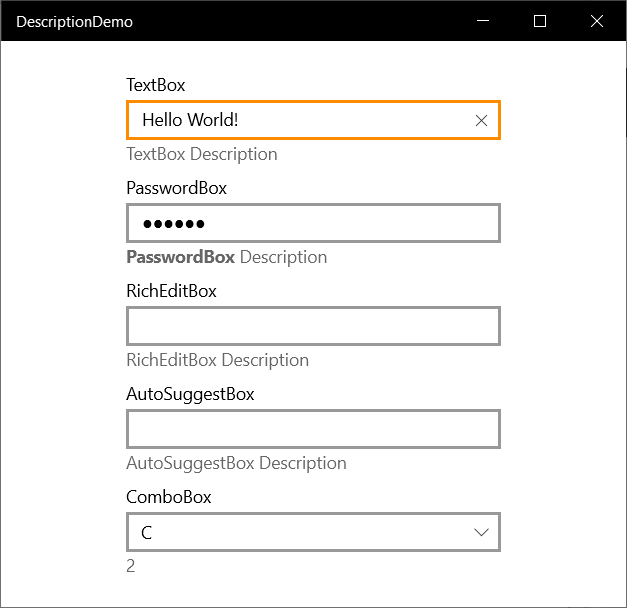
The XAML is very simple. The Description is of the type object. The PasswordBox in this example has a TextBlock with two Runs (one Bold) in it as the Description. It also supports DataBinding. The Description of the ComboBox is databound to the SelectedIndex.
<StackPanel HorizontalAlignment="Center"
            VerticalAlignment="Center"
            Width="300"
            Spacing="8">
    <TextBox Header="TextBox"
                Text="Hello World!"
                Description="TextBox Description" />
    <PasswordBox Header="PasswordBox"
                    Password="secret">
        <PasswordBox.Description>
            <TextBlock>
        <Run Text="PasswordBox"
                FontWeight="Bold" />
        <Run Text="Description" />
            </TextBlock>
        </PasswordBox.Description>
    </PasswordBox>
    <RichEditBox Header="RichEditBox"
                    Description="RichEditBox Description" />
    <AutoSuggestBox Header="AutoSuggestBox"
                    Description="AutoSuggestBox Description" />
    <ComboBox Header="ComboBox"
                x:Name="comboBoxDemo"
                Description="{x:Bind comboBoxDemo.SelectedIndex, Mode=OneWay}"
                SelectedIndex="2"
                HorizontalAlignment="Stretch">
        <ComboBoxItem Content="A" />
        <ComboBoxItem Content="B" />
        <ComboBoxItem Content="C" />
        <ComboBoxItem Content="D" />
    </ComboBox>
</StackPanel>
Description color
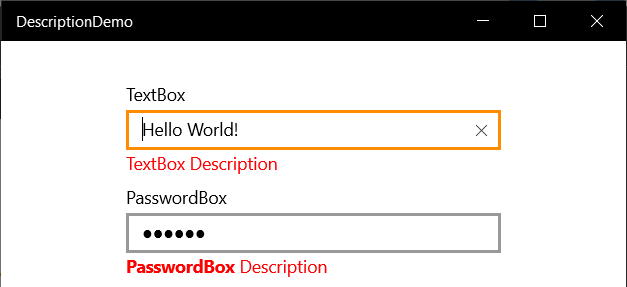
You can easily change the color of the Description by defining a Brush Resource with the Key SystemControlDescriptionTextForegroundBrush. I added one to the StackPanel with the color Red.
<StackPanel HorizontalAlignment="Center"
            VerticalAlignment="Center"
            Width="300"
            Spacing="8">
    <StackPanel.Resources>
        <SolidColorBrush x:Key="SystemControlDescriptionTextForegroundBrush"
                         Color="Red" />
    </StackPanel.Resources>
    <TextBox Header="TextBox"
             Text="Hello World!"
             Description="TextBox Description" />
The Descriptions are now Red.
Closure
The Description is a small but nice new addition. Nothing you couldn't do yourself with a normal TextBlock but this is easier.
Fons
All postings/content on this blog are provided "AS IS" with no warranties, and confer no rights. All entries in this blog are my opinion and don't necessarily reflect the opinion of my employer or sponsors. The content on this site is licensed under a Creative Commons Attribution By license.

Blog comments
0 responses