You can customize the appearance of your apps in many ways by using the XAML framework. Styles let you set control properties and reuse those settings for a consistent appearance across multiple controls.
With Lightweight styling you override the system brushes, and the color override will affect all controls that reference that brush. Although this is called styling you are not defining a style. You just create a ResourceDictionary with a ThemeDictionary in which you override the system brushes.
<Page.Resources>
    <ResourceDictionary>
        <ResourceDictionary.ThemeDictionaries>
            <ResourceDictionary x:Key="Light">
                 <SolidColorBrush x:Key="ButtonBackground"
                                  Color="Transparent"/>
                 <SolidColorBrush x:Key="ButtonForeground"
                                  Color="MediumSlateBlue"/>
                 <SolidColorBrush x:Key="ButtonBorderBrush"
                                  Color="MediumSlateBlue"/>
            </ResourceDictionary>
        </ResourceDictionary.ThemeDictionaries>
    </ResourceDictionary>
</Page.Resources>/>
These overriden system brushes make a normal Button control transparent with a purple border and text (content).
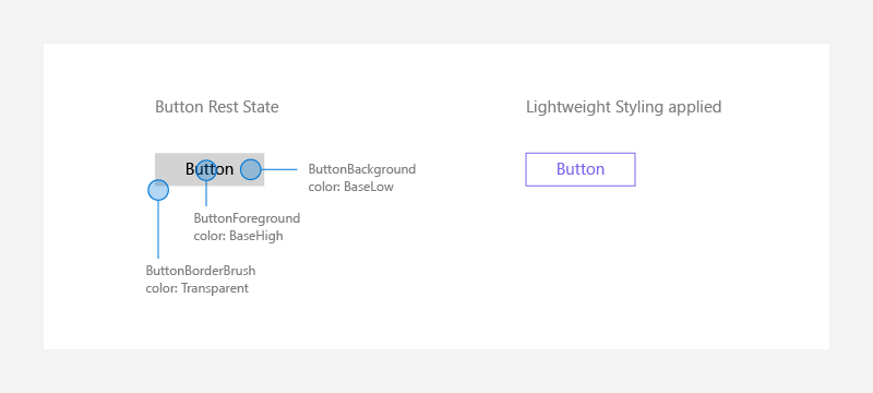
For states like PointerOver (mouse is hovered over the button),PointerPressed (button has been invoked), or Disabled (button is not interactable). These endings are appended onto the original Lightweight styling names:ButtonBackgroundPointerOver, ButtonForegroundPointerPressed, ButtonBorderBrushDisabled, etc. Modifying those brushes as well, will make sure that your controls are colored consistently to your app's theme.
You should also define these brushes in the Default (read 'Dark') theme. If you are not familiar with this you should read the XAML theme resources docs.
Per-control Styling
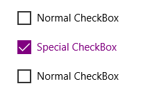
These overrides of the system brushes are generally done at the App or Page level. In the docs you can also read that there is a way you can do this per-control. Changing a single control on one page only to look a certain way, without altering any other versions of that control, is desired:
<CheckBox Content="Normal CheckBox" Margin="5"/>
<CheckBox Content="Special CheckBox" Margin="5">
    <CheckBox.Resources>
        <ResourceDictionary>
            <ResourceDictionary.ThemeDictionaries>
                <ResourceDictionary x:Key="Light">
                    <SolidColorBrush x:Key="CheckBoxForegroundUnchecked"
                        Color="Purple"/>
                    <SolidColorBrush x:Key="CheckBoxForegroundChecked"
                        Color="Purple"/>
                    <SolidColorBrush x:Key="CheckBoxCheckGlyphForegroundChecked"
                        Color="White"/>
                    <SolidColorBrush x:Key="CheckBoxCheckBackgroundStrokeChecked"
                        Color="Purple"/>
                    <SolidColorBrush x:Key="CheckBoxCheckBackgroundFillChecked"
                        Color="Purple"/>
                </ResourceDictionary>
            </ResourceDictionary.ThemeDictionaries>
        </ResourceDictionary>
    </CheckBox.Resources>
</CheckBox>
<CheckBox Content="Normal CheckBox" Margin="5"/>
If you want to do this for two controls you have to override the system brushes for both controls. Each control will have the same ResourceDictionary containing the Themes with the overriden system brushes.
<CheckBox Content="Normal CheckBox" Margin="5"/>
<CheckBox Content="Special CheckBox" Margin="5">
    <CheckBox.Resources>
        <ResourceDictionary>
            <ResourceDictionary.ThemeDictionaries>
                <ResourceDictionary x:Key="Light">
                    <SolidColorBrush x:Key="CheckBoxForegroundUnchecked"
                        Color="Purple"/>
                    <SolidColorBrush x:Key="CheckBoxForegroundChecked"
                        Color="Purple"/>
                    <SolidColorBrush x:Key="CheckBoxCheckGlyphForegroundChecked"
                        Color="White"/>
                    <SolidColorBrush x:Key="CheckBoxCheckBackgroundStrokeChecked"
                        Color="Purple"/>
                    <SolidColorBrush x:Key="CheckBoxCheckBackgroundFillChecked"
                        Color="Purple"/>
                </ResourceDictionary>
            </ResourceDictionary.ThemeDictionaries>
        </ResourceDictionary>
    </CheckBox.Resources>
</CheckBox>
This is not the right solution because you now have duplicate xaml code. This will cause maintenance issues. A better solution is available. You candefine the ResourceDictionary inside a separate ResourceDictionary file and use a Merged DictionaryResource inside the controls.
PurpleCheckboxTheme.xaml
<ResourceDictionary xmlns="http://schemas.microsoft.com/winfx/2006/xaml/presentation"
                    xmlns:x="http://schemas.microsoft.com/winfx/2006/xaml">
    <ResourceDictionary.ThemeDictionaries>
        <ResourceDictionary x:Key="Light">
            <SolidColorBrush x:Key="CheckBoxForegroundUnchecked"
                             Color="Purple" />
            <SolidColorBrush x:Key="CheckBoxForegroundChecked"
                             Color="Purple" />
            <SolidColorBrush x:Key="CheckBoxCheckGlyphForegroundChecked"
                             Color="White" />
            <SolidColorBrush x:Key="CheckBoxCheckBackgroundStrokeChecked"
                             Color="Purple" />
            <SolidColorBrush x:Key="CheckBoxCheckBackgroundFillChecked"
                             Color="Purple" />
        </ResourceDictionary>
    </ResourceDictionary.ThemeDictionaries>
</ResourceDictionary>
Inside the Checkbox controls you used the MergedDictionaries to reference the PurpleCheckboxTheme.xaml file
<CheckBox Content="Special CheckBox">
    <CheckBox.Resources>
        <ResourceDictionary>
            <ResourceDictionary.MergedDictionaries>
                <ResourceDictionary Source="/PurpleCheckboxTheme.xaml" />
            </ResourceDictionary.MergedDictionaries>
        </ResourceDictionary>
    </CheckBox.Resources>
</CheckBox>
This solution work perfect but is it the right one? The values of the system brushes have no duplicates. Still, I don't like this solution. I find it way too verbose.
The right solution
To get rid of the verboseness I tried to place the ResourceDictionary inside a Style. This would make Lightweight styling real styling. Unfortunately this doesn't work (compile) as this screenshot will show you.
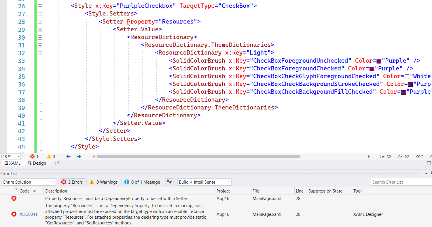
The Resource property is not a Dependency Property so it can't be set inside a (Style) Setter. Luckily the error message also hints towards the solution. An attached property can be used instead. So, I created a ResourcesServices class with a Resources attached property in it. The OnResourcesChanged() method sets the Resources property of the FrameworkElement. It uses a ResourceDictionaryCloner helper class to clone the ResourceDictionary.
public class ResourcesServices {

    /// <summary>
    /// Identifies the Resources attachted property. This enables animation, styling, binding, etc...
    /// </summary>
    public static readonly DependencyProperty ResourcesProperty =
        DependencyProperty.RegisterAttached("Resources",
               typeof(ResourceDictionary),
               typeof(ResourcesServices),
               new PropertyMetadata(default(ResourceDictionary), OnResourcesChanged));

    /// <summary>
    /// Resources changed handler.
    /// </summary>
    /// <param name="d">FrameworkElement that changed its Resources attached property.</param>
    /// <param name="e">DependencyPropertyChangedEventArgs with the new and old value.</param>
    private static void OnResourcesChanged(DependencyObject d, DependencyPropertyChangedEventArgs e) {
        if (d is FrameworkElement source) {
            var value = (ResourceDictionary)e.NewValue;
            ResourceDictionaryCloner.Clone(value, source.Resources);
        }
    }

    /// <summary>
    /// Gets the value of the Resources attached property from the specified FrameworkElement.
    /// </summary>
    public static ResourceDictionary GetResources(DependencyObject obj) {
        return (ResourceDictionary)obj.GetValue(ResourcesProperty);
    }


    /// <summary>
    /// Sets the value of the Resources attached property to the specified FrameworkElement.
    /// </summary>
    /// <param name="obj">The object on which to set the Resources attached property.</param>
    /// <param name="value">The property value to set.</param>
    public static void SetResources(DependencyObject obj, ResourceDictionary value) {
        obj.SetValue(ResourcesProperty, value);
    }
}

internal static class ResourceDictionaryCloner {

    internal static ResourceDictionary Clone(ResourceDictionary resource, ResourceDictionary destination) {
        if (resource == null) return null;

        if (resource.Source != null) {
            destination.Source = resource.Source;
        } else {
            // Clone theme dictionaries
            if (resource.ThemeDictionaries != null) {
                foreach (var theme in resource.ThemeDictionaries) {
                    if (theme.Value is ResourceDictionary themedResource) {
                        var themeDictionary = new ResourceDictionary();
                        Clone(themedResource, themeDictionary);
                        destination.ThemeDictionaries[theme.Key] = themeDictionary;
                    } else {
                        destination.ThemeDictionaries[theme.Key] = theme.Value;
                    }
                }
            }

            // Clone merged dictionaries
            if (resource.MergedDictionaries != null) {
                foreach (var mergedResource in resource.MergedDictionaries) {
                    var themeDictionary = new ResourceDictionary();
                    Clone(mergedResource, themeDictionary);
                    destination.MergedDictionaries.Add(themeDictionary);
                }
            }

            // Clone all contents
            foreach (var item in resource) {
                destination[item.Key] = item.Value;
            }
        }

        return destination;
    }
}
The Property attribute of the Setter element now uses this Attached Property. The 'local' namespace is for this example set to SampleApp. This is the namespace of the ResourcesServices class.
<Page.Resources>
    <Style x:Key="PurlpleCheckbox"
            xmlns:local="using:SampleApp"
            TargetType="CheckBox">
        <Style.Setters>
            <Setter Property="local:ResourcesServices.Resources">
                <Setter.Value>
                    <ResourceDictionary>
                        <ResourceDictionary.ThemeDictionaries>
                            <ResourceDictionary x:Key="Light">
                                <SolidColorBrush x:Key="CheckBoxForegroundUnchecked"
                                                 Color="Purple" />
                                <SolidColorBrush x:Key="CheckBoxForegroundChecked"
                                                 Color="Purple" />
                                <SolidColorBrush x:Key="CheckBoxCheckGlyphForegroundChecked"
                                                 Color="White" />
                                <SolidColorBrush x:Key="CheckBoxCheckBackgroundStrokeChecked"
                                                 Color="Purple" />
                                <SolidColorBrush x:Key="CheckBoxCheckBackgroundFillChecked"
                                                 Color="Purple" />
                            </ResourceDictionary>
                        </ResourceDictionary.ThemeDictionaries>
                    </ResourceDictionary>
                </Setter.Value>
            </Setter>
        </Style.Setters>
    </Style>
</Page.Resources>
So, if you want two CheckBoxes with this lightweight style you can just assign the PurpleCheckbox to the Style property of those two controls. This is very compact code which makes it perfect.
<CheckBox Content="Normal CheckBox" />
<CheckBox Content="Special CheckBox"
          Style="{StaticResource PurlpleCheckbox}" />
<CheckBox Content="Special CheckBox"
          Style="{StaticResource PurlpleCheckbox}" />
Closure
I think that Lightweight styling is great and with this Resources attached property is super clean. No duplicate code and very compact. Just the way I like it. I hope you like it too.
Fons
Update 12-1-2021: My original code was not tested correctly. Rudy Hyun mentioned this in this tweet, thanks. He has a solution for my problem which he already implemented in the XamlPlus project. I took (stole) his ResourceDictionaryCloner and added this to this blog. You might also decide to use the XamlPlus style project instead. It has a Style class with a Resources attached property. I think it even functions better than mine when you change the RequestedTheme on runtime.
All postings/content on this blog are provided "AS IS" with no warranties, and confer no rights. All entries in this blog are my opinion and don't necessarily reflect the opinion of my employer or sponsors. The content on this site is licensed under a Creative Commons Attribution By license.

Blog comments
0 responses